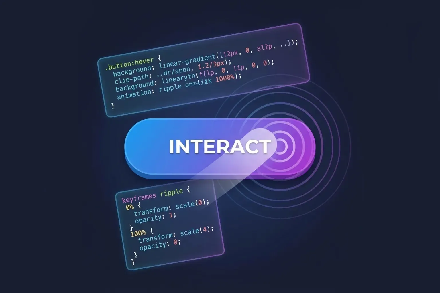
The approach
Exploring a few animated button background effects on interaction. The basic thought process is to position the button as relative and then animate an absolutely positioned pseudo-element (::before or ::after) within it, often with overflow: hidden on the parent.
The animation trigger is usually hover or active (click), with focus-visible also being styled so keyboard users and touch devices (where hover can be sticky or non-existent) still get visual feedback.
1. Swipe Right
A simple “fill” effect where the background slides in from the left.
The CSS
.btn.swipe {
    --bg-color: #235459;
    --bg-color-hover: #4bb1c0;
    --txt-color: white;
    --animate-duration: 0.3s;

    position: relative;
    overflow: hidden;
    isolation: isolate; /* Creates a new stacking context */
    background-color: var(--bg-color);
    color: var(--txt-color);
    /* ...other styles... */
}

.btn.swipe::before {
    content: "";
    position: absolute;
    inset: 0;
    z-index: -1;
    background-color: var(--bg-color-hover);
    transform: translateX(-100%);
    transition: transform var(--animate-duration) cubic-bezier(0.4, 0, 0.2, 1);
}

.btn.swipe:hover::before,
.btn.swipe:focus-visible::before {
    transform: translateX(0);
}
2. Click Circle Expand
This effect creates a ripple-like circle expansion from the center when the button is clicked (active state).
The CSS
.btn.click-circle {
    /* ...variables... */
    position: relative;
    overflow: hidden;
    isolation: isolate;
}

.btn.click-circle::before {
    content: "";
    position: absolute;
    top: 50%;
    left: 50%;
    width: 0;
    height: 0;
    border-radius: 50%;
    transform: translate(-50%, -50%); /* Center the element */
    z-index: -1;
    background-color: var(--bg-color-hover);
    transition:
        width var(--animate-duration) ease-out,
        height var(--animate-duration) ease-out;
}

.btn.click-circle:active::before,
.btn.click-circle:focus-visible::before {
    width: 250%;
    height: 250%;
}
3. Shutter Up/Down
Two panels “close” from the top and bottom to fill the background.
The CSS
.btn.shutter {
    /* ... */
    position: relative;
    overflow: hidden;
    background-color: transparent;
    color: var(--bg-color);
    /* ... */
}

.btn.shutter::before,
.btn.shutter::after {
    content: "";
    position: absolute;
    left: 0;
    width: 100%;
    height: 50%;
    background-color: var(--bg-color);
    z-index: -1;
    transition: transform 0.25s cubic-bezier(0.77, 0, 0.175, 1);
}

.btn.shutter::before {
    top: 0;
    transform: translateY(-100%);
}

.btn.shutter::after {
    bottom: 0;
    transform: translateY(100%);
}

.btn.shutter:hover::before,
.btn.shutter:focus-visible::before,
.btn.shutter:hover::after,
.btn.shutter:focus-visible::after {
    transform: translateY(0);
}
4. Diagonal Swipe
A variation of the swipe effect where a skewed element slides across, creating a dynamic angle.
The CSS
.btn.diagonal::before {
    content: "";
    position: absolute;
    top: 0;
    left: -20%; /* wider to cover skew */
    width: 140%;
    height: 100%;
    background-color: var(--bg-color-hover);
    transform: skewX(-20deg) translateX(-110%);
    z-index: -1;
    transition: transform 0.35s cubic-bezier(0.3, 1, 0.8, 1);
}

.btn.diagonal:hover::before {
    transform: skewX(-20deg) translateX(0);
}
5. Gradient Glow
Instead of a solid fill, this uses animates a gradient or shadow to create a glowing effect.
The CSS
.btn.glow {
    /* ... */
    transition:
        transform 0.2s ease,
        box-shadow 0.2s ease;
    box-shadow: 0 0 0 0 rgba(75, 177, 192, 0.7);
}

.btn.glow:hover,
.btn.glow:focus-visible {
    transform: translateY(-2px);
    box-shadow: 0 4px 20px 0 rgba(75, 177, 192, 0.6);
}